Data is the crux of analytics and is displayed in a lot of ways. To start with analytics we need to understand data displayed in various ways. Lets talk about a few ways in which data can be displayed and the advantages of the methods.
Data Matrix: Each row in a data matrix represents an observation and the columns contain variables which provide useful information about the respective observations. The convenience with matrices is that additional observation and variables can be easily added to an already existing data. Thats the reason it is a very common way of storing and understanding data.
| Players | Runs Scored | Average | Half Centuries |
| Anuj Sharma |
1250
|
48.20
|
8
|
| Bhavesh Singh |
2200
|
52.60
|
14
|
| Abhijeet Garg |
1980
|
26.50
|
5
|
| Abhishek Malik |
580
|
18.00
|
0
|
Scatterplot: It is a graphical representation of two numerical variables in an observation-by-observation manner. The advantage of using a scatterplot is that a relationship or association between the variables can be easily spotted.

Dot plot: A dot plot is useful when a single variable has to be represented and is useful only for small data sets. It can be called a single variable scatterplot.

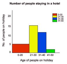
Histogram: Now dot plot is for small data sets but what if the data sets are large,for that we have histograms. It is difficult to display each observation as the data set is large therefor the data is divided into groups or bins and these bins are plotted as bars.
Histograms are convenient when it comes to describing the shape of data distribution and to understand if the data is skewed or symmetric.Looking at the peaks of the histogram it can be easily understood if the data in unimodal,bimodal or multimodal.
Box plot: Box plot represents data in a way that the median,1st quartile,3rd quartile,interquartile range,lower and upper whiskers as well as the outliers are prominent. It is used when we want to check any of these statistics. It is sometimes also known as whisker plot.

Contingency Table: Contingency tables are used to represent data for two categorical variables. The values represent the count of the corresponding combination of variables. it is useful for examining the relationship between these categorical variables.

Bar Plot: It is used to display a single categorical variable.
